# PredictEasy

AI Powered Data Analytics tool by PredictEasy

Drive business growth with our user-friendly data analytics platform. Easily perform exploratory analysis, simplify data cleaning, and generate automated reports for quick insights, visualize data relationships, and streamline ML model simulations. No coding expertise needed!

### Capabilities of PredictEasy!

* Perform effortless basic exploratory analysis. Now cleaning and understanding data has become easy with our intuitive data analytics platform.
* Seamlessly visualize data with a code-free interface. Create interactive charts, graphs and dashboard, presenting your data in the most meaningful way.
* Leverage the power of ML algorithms without the need for coding expertise. The platform includes pre-built ML models that can be easily trained and deployed to make predictions, classify data or identify anomalies.
* Automated report generation from data, presenting the findings in an easy-to-understand format, enabling users to quickly grasp the most important insights and take data-driven actions.
* Streamline your ML model simulation with ready-to-use stacks. Visualise data relationships, leverage machine learning techniques, and solve a wide range of problems across industries.

### PredictEasy as an add-on in Google Sheets

Start your data-driven adventure with the user-friendly PredictEasy, a dynamic add-on designed to seamlessly elevate your <mark style="color:green;">Google Sheets</mark> experience. Uncover the potential hidden within your data using a suite of cutting-edge features tailored for effortless analysis and prediction.

**Data Preparation:** Streamline your data pre-processing with intuitive tools that ensure your datasets are clean, organized, and ready for insightful exploration.

**Statistical Tests:** Empower your analyses with a robust arsenal of statistical tests, allowing you to validate hypotheses, explore relationships, and extract meaningful insights with confidence.

**Time Series Forecasting:** Navigate the future with ease using advanced time series forecasting capabilities. Anticipate trends, make informed decisions, and stay ahead of the curve.

**Predictive Modeling:** Unleash the power of predictive analytics without the need for complex coding. Effortlessly build, train, and deploy models to foresee outcomes and enhance your decision-making prowess.

**NLP & NLG:** Dive into the world of Natural Language Processing (NLP) and Natural Language Generation (NLG) to extract valuable information and communicate findings in a language that resonates.

**Visualization Charts:** Transform your data into compelling visual narratives with an array of visualization charts. From line graphs to heatmaps, craft captivating representations that bring your insights to life.

PredictEasy is not just an add-on; it's your companion in the realm of predictive analytics, offering a seamless bridge between your data and actionable insights. Elevate your Google Sheets experience and transform the way you interact with data – welcome to the future of prediction, welcome to PredictEasy!!

### What we offer!

<details>

<summary>Data Preparation</summary>

<img src="https://2063668468-files.gitbook.io/~/files/v0/b/gitbook-x-prod.appspot.com/o/spaces%2F9RcwqzNNsjo496JLJ2Ob%2Fuploads%2FK93b2SgP17BNAmP2u2j8%2Flabelencode.svg?alt=media&amp;token=c2c1ffa6-45e1-4e9f-a7e8-8377cf215078" alt="" data-size="original">[**Label Encode**](/data-preprocessing/label-encoding)

![](https://2063668468-files.gitbook.io/~/files/v0/b/gitbook-x-prod.appspot.com/o/spaces%2F9RcwqzNNsjo496JLJ2Ob%2Fuploads%2FxG6HaBwhrMNB3YPJ2DH3%2Flogtransform.svg?alt=media\&token=24873e04-784d-4a0f-9370-f8399e062b31)[**Log Transform**](/data-preprocessing/log-transform)

![](https://2063668468-files.gitbook.io/~/files/v0/b/gitbook-x-prod.appspot.com/o/spaces%2F9RcwqzNNsjo496JLJ2Ob%2Fuploads%2FdRME850AlEXKknZ3PJzO%2Fstandscale.svg?alt=media\&token=a5123c4d-cfe1-4505-9a68-64ed36bd9138)[**Standard Scaling**](/data-preprocessing/standard-scaling)

![](https://2063668468-files.gitbook.io/~/files/v0/b/gitbook-x-prod.appspot.com/o/spaces%2F9RcwqzNNsjo496JLJ2Ob%2Fuploads%2FSCjXUGeVu8Ef4Xu8JUu6%2Freplace.svg?alt=media\&token=250b7f43-bca6-4e3a-8982-e948f048b47c)[**Replace**](/data-preprocessing/replacement)

![](https://2063668468-files.gitbook.io/~/files/v0/b/gitbook-x-prod.appspot.com/o/spaces%2F9RcwqzNNsjo496JLJ2Ob%2Fuploads%2FZ9ZyE4gyw70fSF72tyik%2Fimpute.svg?alt=media\&token=b41b9fd0-019e-4a39-9932-52781212cb31)[**Impute**](/data-preprocessing/imputation)

</details>

<details>

<summary>Statistical Tests</summary>

![](https://2063668468-files.gitbook.io/~/files/v0/b/gitbook-x-prod.appspot.com/o/spaces%2F9RcwqzNNsjo496JLJ2Ob%2Fuploads%2FTIhpaR4mD9E2YFjzv1dR%2Fstat1.svg?alt=media\&token=5fab35ba-8968-43aa-a8bd-e2d6bee1a26b)[**T-Test**](/statistical-test/t-test)

![](https://2063668468-files.gitbook.io/~/files/v0/b/gitbook-x-prod.appspot.com/o/spaces%2F9RcwqzNNsjo496JLJ2Ob%2Fuploads%2F8CLCI7X0cYOi1fmG9iHs%2Fstat2.svg?alt=media\&token=982252fd-4103-45a8-a55f-1665acdd236b)[**Anova Test**](/statistical-test/anova-test)

![](https://2063668468-files.gitbook.io/~/files/v0/b/gitbook-x-prod.appspot.com/o/spaces%2F9RcwqzNNsjo496JLJ2Ob%2Fuploads%2FJxMztzUFYCIKkB2SMKm7%2Fstat4.svg?alt=media\&token=5791981e-1593-474c-9642-69d8bda3d83c)[**Spearman’s Rank Correlation**](/statistical-test/spearmans-rank-correlation)

![](https://2063668468-files.gitbook.io/~/files/v0/b/gitbook-x-prod.appspot.com/o/spaces%2F9RcwqzNNsjo496JLJ2Ob%2Fuploads%2FZDgVdfyJarBUnDxVC7kY%2Fstat5.svg?alt=media\&token=48c1780e-dc44-4e2c-89c8-7d9122c87386)[**Pearson’s Correlation**](/statistical-test/pearsons-correlation)

![](https://2063668468-files.gitbook.io/~/files/v0/b/gitbook-x-prod.appspot.com/o/spaces%2F9RcwqzNNsjo496JLJ2Ob%2Fuploads%2FexYAKS0AiRuP8hZpg6Hi%2Fstat8.svg?alt=media\&token=3b8780b5-5a6f-4d76-8bb8-b2bc0a16f991)[**Chi-Squared Test**](/statistical-test/chi-squared-test)

![](https://2063668468-files.gitbook.io/~/files/v0/b/gitbook-x-prod.appspot.com/o/spaces%2F9RcwqzNNsjo496JLJ2Ob%2Fuploads%2F28itWMBeOEE6oKHJ6vtc%2Fstat6.svg?alt=media\&token=f5f3e85e-df6b-4d5e-8162-240d67681b0f)[**Shapiro-Wilk Test**](/statistical-test/shapiro-wilk-test)

![](https://2063668468-files.gitbook.io/~/files/v0/b/gitbook-x-prod.appspot.com/o/spaces%2F9RcwqzNNsjo496JLJ2Ob%2Fuploads%2FEvfACdIkw0lo2plonExO%2Fstat7.svg?alt=media\&token=8903cfcf-5f56-4c84-adce-ba1982cef88a)[**Kruskal-Wallis H Test**](/statistical-test/kruskal-wallis-h-test)

![](https://2063668468-files.gitbook.io/~/files/v0/b/gitbook-x-prod.appspot.com/o/spaces%2F9RcwqzNNsjo496JLJ2Ob%2Fuploads%2FexYAKS0AiRuP8hZpg6Hi%2Fstat8.svg?alt=media\&token=3b8780b5-5a6f-4d76-8bb8-b2bc0a16f991)[**Friedman Test**](/statistical-test/friedman-test)

</details>

<details>

<summary>Predictive Modelling</summary>

<img src="https://2063668468-files.gitbook.io/~/files/v0/b/gitbook-x-prod.appspot.com/o/spaces%2F9RcwqzNNsjo496JLJ2Ob%2Fuploads%2FSYImEN5Jya0T4AgEA6RE%2Fclassification.svg?alt=media&amp;token=091ace96-194f-43ef-ba6e-883a48d98e05" alt="" data-size="original"> [**Classification**](/data-modelling/classification)

<img src="https://2063668468-files.gitbook.io/~/files/v0/b/gitbook-x-prod.appspot.com/o/spaces%2F9RcwqzNNsjo496JLJ2Ob%2Fuploads%2FAfmgzLke0Hv1rsqCT6Mp%2Fregression.svg?alt=media&amp;token=c9f76419-b57c-4787-bb1b-21b60dbeb6c5" alt="" data-size="original">  [**Regression**](/data-modelling/regression)

<img src="https://2063668468-files.gitbook.io/~/files/v0/b/gitbook-x-prod.appspot.com/o/spaces%2F9RcwqzNNsjo496JLJ2Ob%2Fuploads%2F5MZlO96qaLwexRUu96Bf%2Fclustering.svg?alt=media&amp;token=b8108f0f-4599-403e-93d9-dd7de6ade1d7" alt="" data-size="original">  [**Clustering**](/data-modelling/clustering)

</details>

<details>

<summary>NLP</summary>

<img src="https://2063668468-files.gitbook.io/~/files/v0/b/gitbook-x-prod.appspot.com/o/spaces%2F9RcwqzNNsjo496JLJ2Ob%2Fuploads%2Fl0y4Axblo59n41K25t9P%2Fsentiment.svg?alt=media&amp;token=e5eecc95-12f9-4a64-9ce7-56c5aa9ce9d2" alt="" data-size="line">  [**Sentiment Analysis**](/nlp/sentiment-analysis)

</details>

<details>

<summary>Visualization Charts</summary>

</details>


# Getting Started


# Installation

Steps to install PredictEasy

Installing an extension in Google Sheets is a straightforward process. Here are the general steps:

1. **Open Google Sheets:** Start by opening Google Sheets in your web browser and sign in to your Google account.
2. **Access Add-ons:** In the menu bar, look for the "Add-ons" option. Click on it, and a drop-down menu will appear.
3. **Get Add-ons:** In the drop-down menu, select "Get add-ons." This will take you to the Google Workspace Marketplace.
4. **Search for the Extension:** In the Google Workspace Marketplace, use the search bar to find PredictEasy.
5. **Select the Extension:** Once you find the PredictEasy, click on it to view more details.
6. **Install the Extension:** On the extension's page, look for the "Install" button. Click on it to begin the installation process.
7. **Grant Permissions:** A window may pop up asking for permissions. Review the permissions requested by the extension, and if you are comfortable, click on the "Continue" or "Grant Permissions" button.
8. **Complete Installation:** Follow any additional on-screen instructions to complete the installation. Once the installation is finished, the extension will be available in your Google Sheets.
9. **Access the Extension:** After installation, you can usually find the extension under the "Add-ons" menu in Google Sheets.&#x20;
10. **Explore and Use:** Start exploring the features of the installed extension. Depending on the extension's purpose, you may need to configure settings or follow specific steps to utilize its functionality.

#### Here's a link for PredictEasy

{% embed url="<https://workspace.google.com/u/0/marketplace/app/predicteasy/223614398740>" fullWidth="false" %}

**Steps:**

<figure><img src="https://2063668468-files.gitbook.io/~/files/v0/b/gitbook-x-prod.appspot.com/o/spaces%2F9RcwqzNNsjo496JLJ2Ob%2Fuploads%2FwjNHXDqTBOoJ4W2iaS4Z%2FScreenshot%202023-11-21%20094507.png?alt=media&amp;token=0341e493-06a8-4a38-be6f-7736879a029d" alt=""><figcaption></figcaption></figure>

<figure><img src="https://2063668468-files.gitbook.io/~/files/v0/b/gitbook-x-prod.appspot.com/o/spaces%2F9RcwqzNNsjo496JLJ2Ob%2Fuploads%2FCYoudLwuKyBqoP82DJkm%2Fimage.png?alt=media&amp;token=9cab04d2-c507-443c-b04b-9fbef7eb2aea" alt=""><figcaption></figcaption></figure>

{% hint style="info" %}

#### Click the Install button to begin the installation process.

{% endhint %}

Now that PredictEasy is seamlessly integrated into your Google Sheets, you're good to start exploring its functionalities. Now Let's dive into the features of PredictEasy in brief.


# Data Preprocessing

Data preprocessing is a critical step in the data analysis and machine learning pipeline for several reasons.

1. **Data Quality Enhancement:** Raw data commonly contains errors, missing values, and outliers. Preprocessing rectifies these issues, ensuring cleaner data with improved quality for analysis.
2. **Feature Engineering:** Preprocessing allows for the creation or transformation of features to better represent underlying data patterns. This involves scaling, normalizing, or encoding variables for improved modeling.
3. **Normalization and Standardization:** Addressing varying scales in datasets, normalization or standardization ensures uniform feature scales, preventing dominance by certain features with larger scales.
4. **Categorical Data Handling:** Machine learning models often struggle with categorical data. Preprocessing, such as label encoding or one-hot encoding, converts categorical variables into formats compatible with these models.
5. **Enhancing Model Performance:** Well-preprocessed data contributes to better model performance, making models more robust, quicker to train, and less susceptible to overfitting.
6. **Handling Missing Data:** Real-world datasets frequently have missing values. Preprocessing techniques like imputation fill in these gaps, allowing for effective use of the data in analysis or modeling.
7. **Reducing Computational Costs:** Clean and preprocessed data require less computational power for modeling, minimizing unnecessary overhead during model training.
8. **Enabling Model Interpretability:** Preprocessing methods can simplify the relationship between features and target variables, enhancing model interpretability and understanding.

Data preprocessing is crucial to prepare data for analysis and modeling, addressing various issues to make it more reliable, understandable, and suitable for diverse machine learning or statistical techniques. Let's look at each features offered by PredictEasy.

### Data Preparation Techniques

<table data-view="cards" data-full-width="false"><thead><tr><th></th><th data-hidden data-card-target data-type="content-ref"></th><th data-hidden data-card-cover data-type="files"></th></tr></thead><tbody><tr><td>          <strong>Label Encoder</strong></td><td><a href="/data-preprocessing/label-encoding">Label Encoding</a></td><td><a href="https://2063668468-files.gitbook.io/~/files/v0/b/gitbook-x-prod.appspot.com/o/spaces%2F9RcwqzNNsjo496JLJ2Ob%2Fuploads%2FZa3Ei90CyvryfTFHbbaf%2Flabelencode.svg?alt=media&amp;token=63bf370e-84cb-44bd-9a97-cda493d56cec">labelencode.svg</a></td></tr><tr><td>          <strong>Log Transform</strong></td><td><a href="/data-preprocessing/log-transform">Log Transform</a></td><td><a href="https://2063668468-files.gitbook.io/~/files/v0/b/gitbook-x-prod.appspot.com/o/spaces%2F9RcwqzNNsjo496JLJ2Ob%2Fuploads%2FxG6HaBwhrMNB3YPJ2DH3%2Flogtransform.svg?alt=media&amp;token=24873e04-784d-4a0f-9370-f8399e062b31">logtransform.svg</a></td></tr><tr><td>         <strong>Standard Scaling</strong></td><td><a href="/data-preprocessing/standard-scaling">Standard Scaling</a></td><td><a href="https://2063668468-files.gitbook.io/~/files/v0/b/gitbook-x-prod.appspot.com/o/spaces%2F9RcwqzNNsjo496JLJ2Ob%2Fuploads%2FdRME850AlEXKknZ3PJzO%2Fstandscale.svg?alt=media&amp;token=a5123c4d-cfe1-4505-9a68-64ed36bd9138">standscale.svg</a></td></tr><tr><td>           <strong>Replacement</strong></td><td><a href="/data-preprocessing/replacement">Replacement</a></td><td><a href="https://2063668468-files.gitbook.io/~/files/v0/b/gitbook-x-prod.appspot.com/o/spaces%2F9RcwqzNNsjo496JLJ2Ob%2Fuploads%2FSCjXUGeVu8Ef4Xu8JUu6%2Freplace.svg?alt=media&amp;token=250b7f43-bca6-4e3a-8982-e948f048b47c">replace.svg</a></td></tr><tr><td>             <strong>Imputation</strong></td><td><a href="/data-preprocessing/imputation">Imputation</a></td><td><a href="https://2063668468-files.gitbook.io/~/files/v0/b/gitbook-x-prod.appspot.com/o/spaces%2F9RcwqzNNsjo496JLJ2Ob%2Fuploads%2FZ9ZyE4gyw70fSF72tyik%2Fimpute.svg?alt=media&amp;token=b41b9fd0-019e-4a39-9932-52781212cb31">impute.svg</a></td></tr></tbody></table>


# Label Encoding

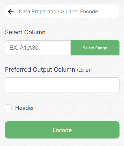
Label encoding is a technique used to **convert categorical data into numerical format.** It assigns a unique integer to each category, allowing algorithms to work with categorical variables. For example, converting 'Red', 'Blue', and 'Green' to 0, 1, and 2, respectively.

<figure><img src="https://2063668468-files.gitbook.io/~/files/v0/b/gitbook-x-prod.appspot.com/o/spaces%2F9RcwqzNNsjo496JLJ2Ob%2Fuploads%2Fqi3DaznPoiSiD2DYZAxT%2Fimage.png?alt=media&amp;token=39fce040-65c4-4168-aa0a-e49f728f049a" alt="" width="310"><figcaption></figcaption></figure>

**Steps to follow :**

1. Identify and highlight the columns you wish to label encode. Click and drag to select the specific range (e.g., A1:A30).
2. Look for the "Label Encoding" option within PredictEasy and select specific range.
3. If the selected area has headers, make sure to check the checkbox designated for headers. This ensures that the add-on considers the header row as header during the label encoding process.
4. Click the "Encode" button within the PredictEasy interface. This action triggers the label encoding process.

#### &#x20;<a href="#mf4hj1q8y9un" id="mf4hj1q8y9un"></a>


# Log Transform

The log transformation is, arguably, the most popular among the different types of transformations used to **transform skewed data to approximately conform to normality.** It's especially useful when the data has a long tail, i.e., it's positively or negatively skewed. Log transformation can help stabilize variance and make relationships between variables more linear.

<figure><img src="https://2063668468-files.gitbook.io/~/files/v0/b/gitbook-x-prod.appspot.com/o/spaces%2F9RcwqzNNsjo496JLJ2Ob%2Fuploads%2FsljstymMm5ddRh8jjnmB%2Fimage.png?alt=media&amp;token=7a38179d-f604-483f-91c2-2b63ddd8d086" alt="" width="311"><figcaption></figcaption></figure>

**Steps to follow:**

1. Identify and highlight the columns you wish to Log Transform. Click and drag to select the specific range (e.g., A1:A30).
2. Look for the "Log Transform" option within PredictEasy and select specific range.
3. &#x20;If the selected area has headers, make sure to check the checkbox designated for headers. This ensures that the add-on considers the first row as header during the log transformation process.
4. Click the "Transform" button within the PredictEasy interface. This action triggers the Log Transformation process.


# Standard Scaling

Standard scaling (or standardization) rescales numeric data to have a mean of 0 and a standard deviation of 1. It's especially useful for algorithms that assume features are centered around zero and have a uniform variance. This scaling method doesn't have specific upper and lower bounds, but it transforms data to have a mean of 0 and unit variance.

<figure><img src="https://2063668468-files.gitbook.io/~/files/v0/b/gitbook-x-prod.appspot.com/o/spaces%2F9RcwqzNNsjo496JLJ2Ob%2Fuploads%2F479Q5kXANa7g5AzYpH41%2Fimage.png?alt=media&amp;token=05da6cd2-eadc-4673-b52f-4b430b48327b" alt="" width="299"><figcaption></figcaption></figure>

Steps to follow:

1. Identify and highlight the columns you wish to standardize. Click and drag to select the specific range (e.g., A1:A30).
2. Look for the "Standard scale" option within PredictEasy and select specific range.
3. If the selected area has headers, make sure to check the checkbox designated for headers. This ensures that the add-on considers the first row as header during the Standard scalar process.
4. Click the "scale" button within the PredictEasy interface. This action triggers the standardization process.


# Replacement

Replacement involves **substituting certain values within a dataset.** For example, replacing missing values with a predefined value like mean, median, or a specific constant, or replacing certain categories with new values. It's useful for handling missing data or modifying specific entries in a dataset.

<figure><img src="https://2063668468-files.gitbook.io/~/files/v0/b/gitbook-x-prod.appspot.com/o/spaces%2F9RcwqzNNsjo496JLJ2Ob%2Fuploads%2FvBDqCy9SxbNKTnjalavH%2Fimage.png?alt=media&amp;token=841669df-af41-4fc5-be87-d9a976c2ca92" alt="" width="303"><figcaption></figcaption></figure>

**Steps to follow:**

1. Choose the column where you want to perform the "Find and Replace" operation.&#x20;
2. Look for the "Find and Replace" option within PredictEasy.&#x20;
3. In the "Find" field, enter the text or value you want to locate within the selected column.
4. In the "Replace" field, enter the text or value you want to replace the found instances with.
5. Initiate the "Find and Replace" operation. This action triggers the replacement process.


# Imputation

Imputation refers to the process of **replacing missing data with substituted values.** The missing data might be filled using different statistical methods such as mean, median, or mode imputation, or even more sophisticated methods like K-nearest neighbors or predictive models to estimate the missing values based on other available information.

<figure><img src="https://2063668468-files.gitbook.io/~/files/v0/b/gitbook-x-prod.appspot.com/o/spaces%2F9RcwqzNNsjo496JLJ2Ob%2Fuploads%2F3T0krRJWQtbEC6QI2tRh%2Fimage.png?alt=media&amp;token=2c17b617-c914-464b-9703-c44979cdc3d4" alt="" width="311"><figcaption></figcaption></figure>

\
**Steps to follow:**

1. Choose the column where you want to perform the "Imputation" operation.&#x20;
2. Look for the "Imputation" option within PredictEasy.&#x20;
3. Select the method of Imputation such as Mean or Median.
4. Initiate the "Imputation" operation. This action triggers the imputation process.

<br>


# Statistical Test

Statistical testing is a cornerstone of data analysis, providing a systematic approach to evaluate hypotheses and draw reliable conclusions from empirical observations. In this analytical toolkit, various tests serve distinct purposes, catering to the diverse needs of researchers and analysts. The t-test, ANOVA test, Spearman’s Rank Correlation, Pearson’s Correlation, Chi-Squared Test, Shapiro-Wilk Test, Kruskal-Wallis H Test, and Friedman Test represent a comprehensive suite of statistical tools.

The t-test is fundamental for comparing means between two groups, while the ANOVA test extends this capability to multiple groups. Spearman’s Rank Correlation and Pearson’s Correlation assess the relationships between variables, offering insights into the strength and nature of associations. The Chi-Squared Test examines the independence of categorical variables, a crucial consideration in contingency table analysis. The Shapiro-Wilk Test evaluates data normality, influencing subsequent parametric analyses.

For scenarios where assumptions of normality are not met, the Kruskal-Wallis H Test serves as a non-parametric alternative to ANOVA, and the Friedman Test extends this comparison to repeated measurements. Together, these tests empower analysts to explore, validate, and interpret data across a spectrum of research questions and experimental designs, contributing to the robustness and reliability of statistical analyses.

### Statistical tests we offer

<table data-view="cards" data-full-width="false"><thead><tr><th></th><th data-hidden data-card-target data-type="content-ref"></th><th data-hidden data-card-cover data-type="files"></th></tr></thead><tbody><tr><td>              <strong>T-Test</strong></td><td><a href="/statistical-test/t-test">T-Test</a></td><td><a href="https://2063668468-files.gitbook.io/~/files/v0/b/gitbook-x-prod.appspot.com/o/spaces%2F9RcwqzNNsjo496JLJ2Ob%2Fuploads%2FTIhpaR4mD9E2YFjzv1dR%2Fstat1.svg?alt=media&amp;token=5fab35ba-8968-43aa-a8bd-e2d6bee1a26b">stat1.svg</a></td></tr><tr><td>           <strong>ANOVA Test</strong></td><td><a href="/statistical-test/anova-test">ANOVA Test</a></td><td><a href="https://2063668468-files.gitbook.io/~/files/v0/b/gitbook-x-prod.appspot.com/o/spaces%2F9RcwqzNNsjo496JLJ2Ob%2Fuploads%2F8CLCI7X0cYOi1fmG9iHs%2Fstat2.svg?alt=media&amp;token=982252fd-4103-45a8-a55f-1665acdd236b">stat2.svg</a></td></tr><tr><td>         <strong>Spearman Rank</strong> </td><td><a href="/statistical-test/spearmans-rank-correlation">Spearman’s Rank Correlation</a></td><td><a href="https://2063668468-files.gitbook.io/~/files/v0/b/gitbook-x-prod.appspot.com/o/spaces%2F9RcwqzNNsjo496JLJ2Ob%2Fuploads%2FJxMztzUFYCIKkB2SMKm7%2Fstat4.svg?alt=media&amp;token=5791981e-1593-474c-9642-69d8bda3d83c">stat4.svg</a></td></tr><tr><td>      <strong>Pearson's Correlation</strong></td><td><a href="/statistical-test/pearsons-correlation">Pearson’s Correlation</a></td><td><a href="https://2063668468-files.gitbook.io/~/files/v0/b/gitbook-x-prod.appspot.com/o/spaces%2F9RcwqzNNsjo496JLJ2Ob%2Fuploads%2FZDgVdfyJarBUnDxVC7kY%2Fstat5.svg?alt=media&amp;token=48c1780e-dc44-4e2c-89c8-7d9122c87386">stat5.svg</a></td></tr><tr><td>        <strong>Chi-Squared Test</strong></td><td><a href="/statistical-test/chi-squared-test">Chi-Squared Test</a></td><td><a href="https://2063668468-files.gitbook.io/~/files/v0/b/gitbook-x-prod.appspot.com/o/spaces%2F9RcwqzNNsjo496JLJ2Ob%2Fuploads%2FWRpBSV2e1IV5hHXB3Gq3%2Fstat3.svg?alt=media&amp;token=7039a6a7-d733-42de-aa0e-63afb8e37723">stat3.svg</a></td></tr><tr><td>       <strong>Shapiro-Wilk Test</strong></td><td><a href="/statistical-test/shapiro-wilk-test">Shapiro-Wilk Test</a></td><td><a href="https://2063668468-files.gitbook.io/~/files/v0/b/gitbook-x-prod.appspot.com/o/spaces%2F9RcwqzNNsjo496JLJ2Ob%2Fuploads%2F28itWMBeOEE6oKHJ6vtc%2Fstat6.svg?alt=media&amp;token=f5f3e85e-df6b-4d5e-8162-240d67681b0f">stat6.svg</a></td></tr><tr><td>    <strong>Kruskal-Wallis H Test</strong></td><td></td><td><a href="https://2063668468-files.gitbook.io/~/files/v0/b/gitbook-x-prod.appspot.com/o/spaces%2F9RcwqzNNsjo496JLJ2Ob%2Fuploads%2FEvfACdIkw0lo2plonExO%2Fstat7.svg?alt=media&amp;token=8903cfcf-5f56-4c84-adce-ba1982cef88a">stat7.svg</a></td></tr><tr><td>          <strong>Friedman Test</strong></td><td><a href="/statistical-test/friedman-test">Friedman Test</a></td><td><a href="https://2063668468-files.gitbook.io/~/files/v0/b/gitbook-x-prod.appspot.com/o/spaces%2F9RcwqzNNsjo496JLJ2Ob%2Fuploads%2FexYAKS0AiRuP8hZpg6Hi%2Fstat8.svg?alt=media&amp;token=3b8780b5-5a6f-4d76-8bb8-b2bc0a16f991">stat8.svg</a></td></tr></tbody></table>

1. **T-Test:**
   * The T-Test is employed when comparing the means of two groups to determine if the observed differences are statistically significant. It is commonly used in hypothesis testing when dealing with small sample sizes.
2. **ANOVA Test (Analysis of Variance):**
   * ANOVA is utilized when comparing means across three or more groups. It assesses whether the observed differences in group means are likely due to actual differences in population means or if they could have occurred by chance.
3. **Spearman’s Rank Correlation:**
   * Spearman’s Rank Correlation is a non-parametric test that assesses the strength and direction of monotonic relationships between two variables. It is particularly useful when dealing with ordinal or non-normally distributed data.
4. **Pearson’s Correlation:**
   * Pearson’s Correlation measures the strength and direction of a linear relationship between two continuous variables. It assumes that the data is normally distributed and is sensitive to outliers.
5. **Chi-Squared Test:**
   * The Chi-Squared Test is used to determine if there is a significant association between two categorical variables. It compares the observed distribution of data with the distribution that would be expected if there were no association.
6. **Shapiro-Wilk Test:**
   * The Shapiro-Wilk Test is a test for normality, indicating whether a sample follows a normal distribution. It is widely used to check the assumption of normality in statistical analyses.
7. **Kruskal-Wallis H Test:**
   * The Kruskal-Wallis H Test is a non-parametric alternative to ANOVA, used when comparing three or more independent groups. It assesses whether there are significant differences in the medians of the groups.
8. **Friedman Test:**
   * The Friedman Test is a non-parametric alternative to repeated measures ANOVA. It assesses whether there are significant differences in the medians of three or more related groups over different treatments or time points.


# T-Test

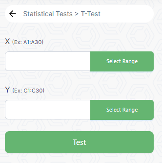
**Use:** To **compare** **means of two groups** to determine if they are significantly different. To check if there is a statistically significant difference between the means of two groups. It's commonly used when you have a small sample size and want to understand if the means of two populations are significantly different.

**Example:** A pharmaceutical company wants to test if a new drug is more effective than a placebo in reducing blood pressure. They compare the average blood pressure measurements before and after treatment for both groups.

<figure><img src="https://2063668468-files.gitbook.io/~/files/v0/b/gitbook-x-prod.appspot.com/o/spaces%2F9RcwqzNNsjo496JLJ2Ob%2Fuploads%2FL11YySo7FnfoyUiZbyAU%2Fimage.png?alt=media&amp;token=d6d6a831-a06a-4ab8-9c88-ffbc20e41558" alt=""><figcaption></figcaption></figure>

{% hint style="info" %}
**Column Requirement:** Continuous data is required for two independent groups.
{% endhint %}

**Steps:**

1. Select two continuous columns, each representing a group (e.g., blood pressure before and after treatment).
2. Ensure that the data distribution is approximately normal or at least not highly skewed.
3. Perform the t-test after selecting the columns using the Test button.
4. Interpret the results and draw conclusions accordingly.


# ANOVA Test

**Use:** ANOVA is used to **compare the means of three or more groups** to see if there's a statistically significant difference between them. It assesses whether there are any statistically significant differences between the means of two or more independent (unrelated) groups.

**Example:** A food manufacturer wants to determine if there are differences in the taste preferences of consumers for multiple variations of a product, like regular, low-fat, and organic.

<figure><img src="https://2063668468-files.gitbook.io/~/files/v0/b/gitbook-x-prod.appspot.com/o/spaces%2F9RcwqzNNsjo496JLJ2Ob%2Fuploads%2FKqaakgPmJkjOI0EJ8AZn%2Fimage.png?alt=media&amp;token=842f7ec0-f2a3-47d4-bf80-151baf392044" alt=""><figcaption></figcaption></figure>

{% hint style="info" %}
**Column Requirement:** Continuous data is required for multiple independent groups.
{% endhint %}

**Steps:**

1. Select a continuous variable (e.g., test scores) and a categorical variable (e.g., treatment groups).
2. Ensure that the data meets the assumptions of normality and homogeneity of variance across groups.
3. Perform the ANOVA test and obtain the p-value.
4. A low p-value indicates that there are significant differences among the group means.
5. If the ANOVA is significant, conduct post-hoc tests (e.g., Tukey HSD) to identify specific group differences.


# Spearman’s Rank Correlation

**Use:** Spearman’s correlation test assesses the **strength and direction of association** between two ranked variables. It's used when variables might not have a linear relationship, as it focuses on the monotonic relationship between variables.

**Example:** Research on how well people ranked in a music competition correlates with their years of training.

<figure><img src="https://2063668468-files.gitbook.io/~/files/v0/b/gitbook-x-prod.appspot.com/o/spaces%2F9RcwqzNNsjo496JLJ2Ob%2Fuploads%2FG82QjzpustbpAZspDc7I%2Fimage.png?alt=media&amp;token=fccc2976-d640-43ca-aeb4-4f24f7702dd6" alt=""><figcaption></figcaption></figure>

{% hint style="info" %}
**Column Requirement:** Ordinal or ranked data.
{% endhint %}

**Steps:**

1. Select two columns with ordinal or ranked data (e.g., ranks or orders).
2. Ensure that the relationship between the variables is monotonic, not necessarily linear.
3. Calculate the Spearman's rank correlation coefficient.
4. Interpret the correlation coefficient; a value close to +1 or -1 indicates a strong monotonic relationship.


# Pearson’s Correlation

**Use:** Pearson’s correlation measures the linear relationship between two continuous variables. It produces a correlation coefficient that ranges from -1 to 1, indicating the **strength and direction of the relationship.**

**Example:** Examining the relationship between hours of study and exam scores for a group of students to see if there's a linear correlation.

<figure><img src="https://2063668468-files.gitbook.io/~/files/v0/b/gitbook-x-prod.appspot.com/o/spaces%2F9RcwqzNNsjo496JLJ2Ob%2Fuploads%2F0AdpvrjmqQ6plJym7Y55%2Fimage.png?alt=media&amp;token=5400ddc8-90f1-4d33-abd4-e76de046f0fd" alt=""><figcaption></figcaption></figure>

{% hint style="info" %}
**Column Requirement:** Continuous data for both variables.
{% endhint %}

**Steps:**

1. Select two columns with continuous data (e.g., height and weight).
2. Check for a linear relationship between the variables.
3. Compute the Pearson correlation coefficient.
4. The coefficient ranges from -1 to 1, where 1 indicates a perfect positive linear relationship, -1 a perfect negative linear relationship, and 0 no linear relationship.


# Chi-Squared Test

**Use:** The Chi-Squared test is used to determine if there's a **significant association between two categorical variables.** It helps assess whether there is a relationship between the variables or if they are independent.

**Example:** Investigating whether there is an association between gender (male or female) and the preference for a particular brand of soft drink.

<figure><img src="https://2063668468-files.gitbook.io/~/files/v0/b/gitbook-x-prod.appspot.com/o/spaces%2F9RcwqzNNsjo496JLJ2Ob%2Fuploads%2F6QFHAoQtU3jsn4WvFB0p%2Fimage.png?alt=media&amp;token=1ce7cf0a-4119-4138-bba9-b6a68fefdbbc" alt=""><figcaption></figcaption></figure>

{% hint style="info" %}
**Column Requirement:** Categorical data for both variables.
{% endhint %}

**Steps:**

1. Select two categorical columns (e.g., gender)
2. Ensure expected frequencies in each cell of the table are not too low (generally above 5) for reliable results.
3. Compute the Chi-squared test statistic.
4. Evaluate the p-value associated with the test statistic.


# Shapiro-Wilk Test

**Use:** The Shapiro-Wilk test is a statistical test used to assess whether a given sample of data follows a **normal distribution.** It is particularly effective for relatively small sample sizes.

**Example:** Checking if the scores of a standardized test in a population follow a normal distribution.

<figure><img src="https://2063668468-files.gitbook.io/~/files/v0/b/gitbook-x-prod.appspot.com/o/spaces%2F9RcwqzNNsjo496JLJ2Ob%2Fuploads%2FvXFagS9Ay1CppG2WK0bv%2Fimage.png?alt=media&amp;token=ec6e2c7f-1321-4b0d-b2a3-85be5236ac91" alt=""><figcaption></figcaption></figure>

{% hint style="info" %}
**Column Requirement:** Continuous data.
{% endhint %}

**Steps:**

1. Select a column with continuous data.
2. Perform the Shapiro-Wilk test to check for normality.
3. Evaluate the test statistic and associated p-value.
4. A low p-value (<0.05) indicates deviation from normality.
5. Normality assumption is violated if the p-value is less than the chosen significance level.


# Kruskal-Wallis H Test

**Use:** The Kruskal-Wallis test is a non-parametric method used to determine if there are statistically significant differences between three or more independent groups. It's suitable for <mark style="color:green;">**non-normally distributed data or ordinal data.**</mark>

**Example:** Assessing whether there is a difference in pain relief among three different painkillers in a clinical trial.

<figure><img src="https://2063668468-files.gitbook.io/~/files/v0/b/gitbook-x-prod.appspot.com/o/spaces%2F9RcwqzNNsjo496JLJ2Ob%2Fuploads%2FtVL0ZR3dQt6wDnko2tHZ%2Fimage.png?alt=media&amp;token=f7fb7038-d48a-4104-8dfb-468610ffd925" alt=""><figcaption></figcaption></figure>

{% hint style="info" %}
**Column Requirement:** Continuous data for the response variable and a categorical variable for groups.
{% endhint %}

**Steps:**

1. Select a continuous variable (e.g., scores) and a categorical variable (e.g., treatments).
2. Check for assumptions such as independence and ordinal data.
3. Perform the Kruskal-Wallis test to compare medians.
4. Evaluate the p-value. A low p-value indicates significant differences between groups.
5. Conduct post-hoc tests for pairwise comparisons if the Kruskal-Wallis test is significant.


# Friedman Test

**Use:** The Friedman test is a non-parametric alternative to ANOVA, used for repeated measures or within-subject designs. It determines if there are **differences among the groups** across multiple treatments or conditions.

**Example:** Testing if there are significant differences in the preferences of individuals for three different types of mobile phones before and after a marketing campaign.

<figure><img src="https://2063668468-files.gitbook.io/~/files/v0/b/gitbook-x-prod.appspot.com/o/spaces%2F9RcwqzNNsjo496JLJ2Ob%2Fuploads%2FBH6t3T04p5BGSljb0lmP%2Fimage.png?alt=media&amp;token=cd8a5251-97ef-4beb-8172-9f4dc8946d3f" alt=""><figcaption></figcaption></figure>

{% hint style="info" %}
**Column Requirement:** Paired or matched continuous data across multiple groups.
{% endhint %}

**Steps:**

1. Select columns with continuous data representing matched groups (e.g., performance of individuals on three different occasions).
2. Ensure that the data is paired or matched.
3. Perform the Friedman test.
4. Evaluate the test statistic and associated p-value.
5. A low p-value suggests significant differences among the matched groups.


# Data Modelling

Predictive modeling involves using historical data to make predictions or forecasts about future outcomes. Here are three common types of predictive modeling techniques.<br>

1. [**Classification**](/data-modelling/classification)**:** In classification predictive modeling, the goal is to categorize or classify data points into predefined classes or groups. The model learns from historical data where the classes are known, and it uses this knowledge to predict the class of new, unseen data. Common applications include spam email detection, sentiment analysis, and disease diagnosis.
2. [**Regression**](/data-modelling/regression)**:** Regression predictive modeling focuses on predicting a continuous outcome or variable. The model analyzes historical data to understand the relationships between input features and the target variable. It then uses this knowledge to make predictions about future, unseen data. Regression is commonly used in financial forecasting, sales predictions, and real estate price estimation.
3. [**Clustering**](/data-modelling/clustering)**:** Clustering predictive modeling involves grouping similar data points together based on inherent patterns or similarities. The model identifies natural clusters within the data without predefined labels, making it an unsupervised learning technique. Clustering is useful in customer segmentation, anomaly detection, and organizing large datasets into meaningful groups.

## What we offer:

Here's a breakdown of what PredictEasy offers after model building, particularly for both classification and regression tasks:

### **Summary Report  (Classification and Regression):**

* Receive a comprehensive summary report that includes all key evaluation metrics for both classification and regression models.

**Evaluation Metrics:**

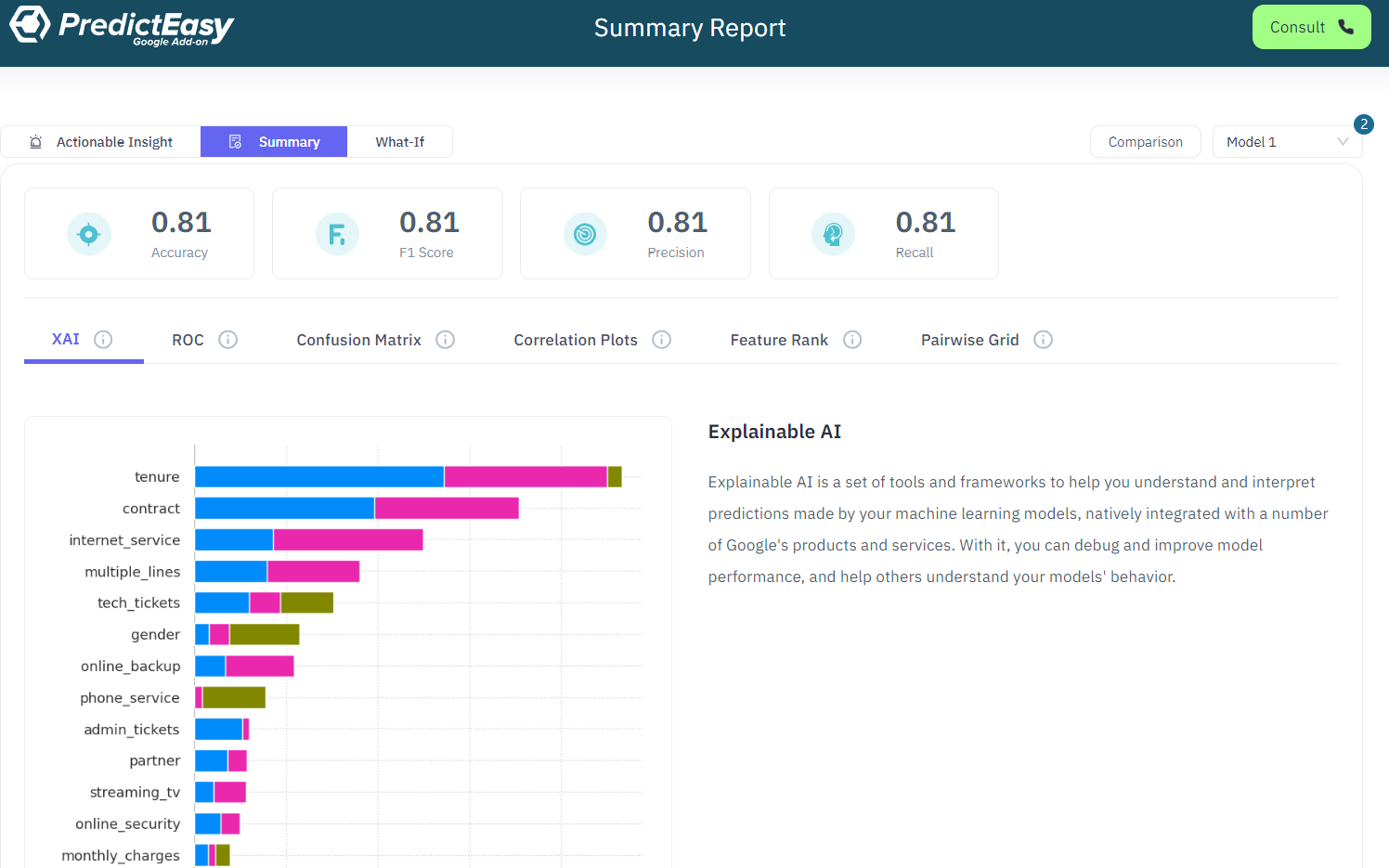
* Metrics for *Classification*: Accuracy, F1 Score, Precision, Recall.
* Metrics for *Regression*: Mean Absolute Error, Mean Squared Error, R-squared.

1. **Explainable AI (XAI):**
   * Leverage Explainable AI to enhance model interpretability.
   * Gain insights into how the model makes decisions, providing transparency and understanding.
2. **ROC (Receiver Operating Characteristic) Curve:**
   * Visualize the performance of classification models with ROC curves.
   * Understand the trade-off between sensitivity and specificity.
3. **Confusion Matrix:**
   * Access the confusion matrix to analyze model performance in classification tasks.
   * Understand true positives, true negatives, false positives, and false negatives.
4. **Correlation Plots:**
   * Explore correlation plots to understand relationships between different variables.
   * Visualize how variables interact with each other in the dataset.
5. **Feature Rank:**
   * Access feature ranking to identify the most influential variables in the model.
   * Understand which features contribute significantly to the model's predictive power.
6. **Pairwise Grid:**
   * Utilize pairwise grid visualizations to analyze relationships between pairs of variables.
   * Identify patterns and correlations in the data.

<figure><img src="https://2063668468-files.gitbook.io/~/files/v0/b/gitbook-x-prod.appspot.com/o/spaces%2F9RcwqzNNsjo496JLJ2Ob%2Fuploads%2FJ27WsCgc9aUZNBtMXmAX%2Fimage.png?alt=media&amp;token=7c2a98a4-0b9f-44f3-99fb-c84f6107712d" alt=""><figcaption></figcaption></figure>

### **Real-Time Simulator:**

* With PredictEasy's real-time interface, where you have the opportunity to dynamically fine-tune model inputs and witness instantaneously the resulting outputs.&#x20;
* This immersive experience allows you to actively engage with your predictive model, enabling you to experiment with different scenarios and observe how changes in input variables directly influence predictions.&#x20;
* This helps you gain valuable insights into the reliability of these predictions by examining confidence levels associated with each output.&#x20;
* This dynamic and user-friendly interface empowers you to not only analyze predictions in real-time but also to understand the underlying factors that contribute to the model's decision-making process, enhancing your overall grasp of the predictive model's behavior.

<figure><img src="https://2063668468-files.gitbook.io/~/files/v0/b/gitbook-x-prod.appspot.com/o/spaces%2F9RcwqzNNsjo496JLJ2Ob%2Fuploads%2Fq69wdZ6KQJRnKdyMp7K4%2Fimage.png?alt=media&amp;token=099e82b2-b27d-458a-a958-86846a5e23a1" alt=""><figcaption></figcaption></figure>

### Actionable Insights:

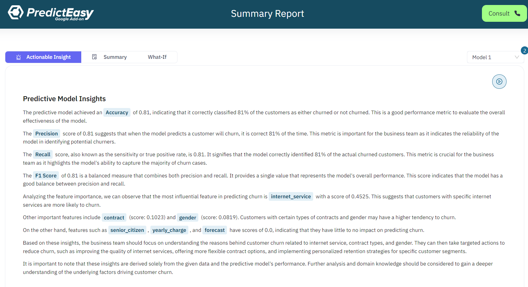
* PredictEasy with Power AI goes beyond conventional model evaluation metrics, offering actionable insights and recommendations for enhanced decision-making.&#x20;
* Through interpretability features and detailed explanations, users can gain profound insights into the factors influencing model predictions.&#x20;
* The platform provides optimization tips and highlights feature importance, guiding users on fine-tuning models for improved performance. With continuous monitoring and collaborative decision-making features, PredictEasy ensures that users stay informed about model performance over time, enabling proactive adjustments and fostering a collaborative environment for data-driven decision-making.

<figure><img src="https://2063668468-files.gitbook.io/~/files/v0/b/gitbook-x-prod.appspot.com/o/spaces%2F9RcwqzNNsjo496JLJ2Ob%2Fuploads%2FF5qCxvLl9pq7acnsSPW9%2Fimage.png?alt=media&amp;token=0d574804-d48b-4db5-9ce2-36716762ab44" alt=""><figcaption></figcaption></figure>


# Classification

**Definition:** Classification is a type of predictive modeling that aims to categorize or assign observations or instances to a predefined set of classes or categories. It's used to predict the category or class of a new dataset, based on training from historical data.

**Example:** Email spam detection, sentiment analysis, disease diagnosis (e.g., classifying a patient as having a particular disease or not based on symptoms).

**Steps:**

**1. Select Independent Columns (X):**&#x20;

* Identify and choose the independent columns in your dataset.&#x20;
* These columns, often referred to as features or predictors, are the variables that will be used to predict the dependent variable(Y).&#x20;

**2. Select Dependent Column (Y):**

* Identify the dependent variable or target variable (Y) that you aim to predict.
* This column represents the output or the variable to be predicted based on the other independent variables (X).

**3. Cross-Validation:**

* Determine the level or number of folds for cross-validation. Cross-validation is a resampling technique used to assess how the results of a predictive model will generalize to an independent dataset.
* Common methods include k-fold cross-validation, where the dataset is divided into k subsets or folds. The model is trained on k-1 folds and tested on the remaining fold, repeated k times.

### **Reports**

**Summary Page**&#x20;

<figure><img src="https://2063668468-files.gitbook.io/~/files/v0/b/gitbook-x-prod.appspot.com/o/spaces%2F9RcwqzNNsjo496JLJ2Ob%2Fuploads%2FfYBdT5BuHmnMmKkP8b59%2Fimage.png?alt=media&amp;token=4d1bfb36-627a-4015-8bb5-cc9a8448d167" alt=""><figcaption></figcaption></figure>

\
\
**Simulator Overview:**

<figure><img src="https://2063668468-files.gitbook.io/~/files/v0/b/gitbook-x-prod.appspot.com/o/spaces%2F9RcwqzNNsjo496JLJ2Ob%2Fuploads%2FpfdQMl7KtS6G3cKTjmDT%2Fimage.png?alt=media&amp;token=17ca1ee1-b0de-4452-9724-797f010d3307" alt=""><figcaption></figcaption></figure>

\
\
**Actionable Insights:**<br>

<figure><img src="https://2063668468-files.gitbook.io/~/files/v0/b/gitbook-x-prod.appspot.com/o/spaces%2F9RcwqzNNsjo496JLJ2Ob%2Fuploads%2Ft5cOWXSZ2RyKSGpPriSg%2Fimage.png?alt=media&amp;token=0d787ddf-f5c8-4194-b459-c0ad82dbb7e3" alt=""><figcaption></figcaption></figure>


# Regression

**Definition:** Regression modeling predicts a continuous outcome or numerical value. It estimates the relationship between one dependent variable and one or more independent variables by fitting a line or curve to the data.

**Example:** Predicting house prices based on features like area, number of bedrooms, and location, predicting sales based on advertising expenditure, estimating the temperature based on time of day and weather conditions.

**Steps:**

**1. Select Independent Columns (X):**&#x20;

* Identify and choose the independent columns in your dataset.&#x20;
* These columns, often referred to as features or predictors, are the variables that will be used to predict the dependent variable(Y).&#x20;

**2. Select Dependent Column (Y):**

* Identify the dependent variable or target variable (Y) that you aim to predict.
* This column represents the output or the variable to be predicted based on the other independent variables (X).

**3. Cross-Validation:**

* Determine the level or number of folds for cross-validation. Cross-validation is a resampling technique used to assess how the results of a predictive model will generalize to an independent dataset.
* Common methods include k-fold cross-validation, where the dataset is divided into k subsets or folds. The model is trained on k-1 folds and tested on the remaining fold, repeated k times.

## **Reports:**

**Summary:**

<figure><img src="https://2063668468-files.gitbook.io/~/files/v0/b/gitbook-x-prod.appspot.com/o/spaces%2F9RcwqzNNsjo496JLJ2Ob%2Fuploads%2FOuqBuQntihJcJWMyITm6%2Fimage.png?alt=media&amp;token=984e5739-0a07-4ba5-974c-e58472ea6a98" alt=""><figcaption></figcaption></figure>

**What-If Simulator:**

<figure><img src="https://2063668468-files.gitbook.io/~/files/v0/b/gitbook-x-prod.appspot.com/o/spaces%2F9RcwqzNNsjo496JLJ2Ob%2Fuploads%2FqoPy5agR2NaxwPT10yGl%2Fimage.png?alt=media&amp;token=d4a22eca-bd34-4b52-a769-6a561fd6a484" alt=""><figcaption></figcaption></figure>

**Actionable Insight:**

<figure><img src="https://2063668468-files.gitbook.io/~/files/v0/b/gitbook-x-prod.appspot.com/o/spaces%2F9RcwqzNNsjo496JLJ2Ob%2Fuploads%2FhXHFdVpGmwNQgXNSeNg6%2Fimage.png?alt=media&amp;token=3c1ba3d8-70c1-4141-b5ad-5ac8dde41cb1" alt=""><figcaption></figcaption></figure>


# Clustering

Clustering is a data analysis technique employed in machine learning and statistics that involves grouping similar data points based on shared characteristics or patterns. Unlike supervised learning, clustering is an unsupervised approach, as it does not require predefined labels for the data points. The objective is to discover inherent structures within the data and organize it into clusters, where items within the same cluster exhibit similarities, while those in different clusters are dissimilar.

**Applications of Clustering:**

1. **Customer Segmentation:**
   * *Application:* Businesses use clustering to categorize customers based on purchasing behavior, demographics, or preferences, enabling targeted marketing strategies.
2. **Anomaly Detection:**
   * *Application:* Clustering aids in identifying unusual patterns or outliers within a dataset, crucial for fraud detection and network security.
3. **Image Segmentation:**
   * *Application:* Clustering is employed to partition an image into meaningful segments, contributing to medical image analysis and computer vision.
4. **Document Clustering:**
   * *Application:* Clustering helps organize documents based on content similarity, facilitating information retrieval and document categorization.
5. **Genomic Clustering:**
   * *Application:* In biomedical research, clustering assists in identifying patterns in genetic data, leading to advancements in disease classification and personalized medicine.
6. **Search Result Clustering:**
   * *Application:* Clustering enhances the organization of search results based on relevance, improving the user experience in search engines.
7. **Recommendation Systems:**
   * *Application:* Clustering contributes to grouping users with similar preferences, enabling personalized content recommendations in areas like movies, products, or articles.
8. **Spatial Data Analysis:**
   * *Application:* Clustering aids in identifying geographic patterns, contributing to urban planning, environmental monitoring, and resource allocation.

Clustering finds applications in diverse domains, providing valuable insights into the underlying structures of complex datasets and contributing to data exploration, pattern recognition, and decision-making processes.

**Steps:**

1. Look for the Clustering section within the PredictEasy.&#x20;
2. Identify and choose the independent variable (X) containing the data for clustering.&#x20;
3. Input the desired total number of clusters that you want the algorithm to generate.&#x20;
4. Trigger the clustering process by clicking on the cluster button.
5. After the clustering process is complete, review the results. The data points should now be organized into distinct clusters based on their similarities.

**Output:**


# NLP

Natural Language Processing

Natural Language Processing (NLP) stands as a cutting-edge field within artificial intelligence that focuses on equipping machines with the ability to understand, interpret, and respond to human language. This multidisciplinary domain incorporates linguistics, computer science, and machine learning, aiming to bridge the communication gap between humans and computers. NLP encompasses a wide range of applications, from language translation and speech recognition to text summarization and sentiment analysis. Through the utilization of sophisticated algorithms, NLP enables machines to comprehend the nuances of language, paving the way for more intuitive and context-aware interactions.


# Sentiment Analysis

One of the standout applications of Natural Language Processing is **Sentiment Analysis**, a technique designed to discern and analyze the emotional tone expressed in textual data. Sentiment Analysis goes beyond mere language processing; it dives into the realm of understanding sentiments—whether positive, negative, or neutral—embedded in written expressions. This invaluable tool finds relevance across diverse industries, aiding businesses in gauging customer feedback, measuring public opinion on social media, and making data-driven decisions. As we navigate the digital landscape, Sentiment Analysis emerges as a pivotal component in unraveling the intricacies of human communication, offering insights that go beyond the surface of mere words.

**Steps**

1. In NLP & NLG section within PredictEasy.
2. Select the Sentiment Analysis option within the NLP & NLG tools.
3. Identify the independent variable (X) containing the text data for sentiment analysis.
4. Define the output column where you want the sentiment analysis results to be displayed.
5. Initiate the sentiment analysis process by clicking on the sentiment button.
6. Once the analysis is complete, you've indicated with positive, negative, and neutral sentiments along with the corresponding counts and also it is appended to next to each row.

**Output:**

<figure><img src="https://2063668468-files.gitbook.io/~/files/v0/b/gitbook-x-prod.appspot.com/o/spaces%2F9RcwqzNNsjo496JLJ2Ob%2Fuploads%2FU8XEdsCyLDmJWGAp3QKT%2Fimage.png?alt=media&amp;token=7a5176fd-cc1e-4212-b4b6-f7ff075898dc" alt="" width="265"><figcaption></figcaption></figure>

<figure><img src="https://2063668468-files.gitbook.io/~/files/v0/b/gitbook-x-prod.appspot.com/o/spaces%2F9RcwqzNNsjo496JLJ2Ob%2Fuploads%2FfRng51iI2j69K0PAUxHD%2Fimage.png?alt=media&amp;token=1434955c-aab7-44c0-9de4-e3e1e80d2a7a" alt=""><figcaption></figcaption></figure>


# Visualization Charts

A visualization chart is a graphical representation of data that is designed to make information more understandable and accessible. The purpose of using charts is to present data in a way that allows patterns, trends, and relationships to be easily identified. Charts are widely used in various fields, including business, science, education, and journalism, to communicate information visually. Visualization charts come in various types, each suited for different types of data and analytical purposes.

1. <img src="https://2063668468-files.gitbook.io/~/files/v0/b/gitbook-x-prod.appspot.com/o/spaces%2F9RcwqzNNsjo496JLJ2Ob%2Fuploads%2Fjtu40rq1hi4UEuvRXqFw%2Fgv6.svg?alt=media&amp;token=9e65cac6-39d5-4a1f-a2f8-a2c4b765befb" alt="" data-size="line">  [**Line Graph:**](/visualization-charts/line-graph)

   * **Purpose:** Shows trends and changes over a continuous interval or time series.
   * **How it works:** Connects data points with straight lines, making it easy to observe the overall trend.
   * **Use cases:** Tracking stock prices over time, analyzing temperature changes, visualizing sales trends.

2. <img src="https://2063668468-files.gitbook.io/~/files/v0/b/gitbook-x-prod.appspot.com/o/spaces%2F9RcwqzNNsjo496JLJ2Ob%2Fuploads%2FRbyo56abzTXHmMkadFMa%2Fgv5.svg?alt=media&amp;token=48e8e740-c01b-4730-9c19-58b2421f651e" alt="" data-size="line">  [**Bar Chart:**](/visualization-charts/bar-chart)

   * **Purpose:** Compares categories or groups of data.
   * **How it works:** Uses rectangular bars of varying lengths to represent the values of different categories.
   * **Use cases:** Comparing sales figures for different products, displaying population distribution by country.

3. <img src="https://2063668468-files.gitbook.io/~/files/v0/b/gitbook-x-prod.appspot.com/o/spaces%2F9RcwqzNNsjo496JLJ2Ob%2Fuploads%2FdWIuboAsis6JI9j4oipv%2Fgv3.svg?alt=media&amp;token=52dfb03a-3106-47a0-91e5-7ef5d59de6bf" alt="" data-size="line"> [**Scatter Plot:**](/visualization-charts/scatter-chart)

   * **Purpose:** Shows the relationship between two variables.
   * **How it works:** Each point on the chart represents a single data point, with its position determined by the values of two variables.
   * **Use cases:** Analyzing the correlation between height and weight, examining the relationship between study hours and exam scores.

4. <img src="https://2063668468-files.gitbook.io/~/files/v0/b/gitbook-x-prod.appspot.com/o/spaces%2F9RcwqzNNsjo496JLJ2Ob%2Fuploads%2FxxqS1g2QkXDBBYnnNY9L%2Fgv4.svg?alt=media&amp;token=2cfce230-7049-47f6-8aa8-66bf54b8c0ad" alt="" data-size="line">[**Area Chart:**](/visualization-charts/area-chart)
   * **Purpose:** Emphasizes the magnitude of change over time for one or more variables.
   * **How it works:** Similar to a line chart, but the area between the line and the axis is filled, highlighting the space underneath the line.
   * **Use cases:** Visualizing the cumulative sales of a product over time, showing the distribution of different types of expenses in a budget.

Each type of chart has its own strengths and is suited to different types of data and analytical goals. The choice of chart depends on the nature of your data and the story you want to convey.


# Line graph

A line graph is a type of chart that displays data points over a continuous interval or time span, connecting them with straight lines. It is particularly useful for illustrating trends, changes, or patterns in data. Line graphs are widely used in various fields, including science, economics, finance, and statistics, to visually represent the relationship between two or more variables.

### **Example:**&#x20;

Consider a line graph tracking the monthly sales of a product over a year. The x-axis would represent the months (January, February, etc.), and the y-axis would represent the sales figures. Each data point on the line would correspond to the sales for a specific month, and the line connecting these points would visually represent the sales trend over the year.

<figure><img src="https://2063668468-files.gitbook.io/~/files/v0/b/gitbook-x-prod.appspot.com/o/spaces%2F9RcwqzNNsjo496JLJ2Ob%2Fuploads%2F0F5qlWEGoSvLbMNs9kAf%2Fimage.png?alt=media&amp;token=250a87ef-7fcd-4c81-80c3-0a6f64aec05d" alt=""><figcaption></figcaption></figure>

### **Steps:**

* Highlight the range of cells containing your data in Google Sheets. Similar to Excel, for X-axis values, select cells in column A (e.g., A1:A30), and for Y-axis values, select cells in column C (e.g., C1:C30).
* Click on Plot to create a line graph.
* You can customize your chart using options in the Chart Editor. For example, you can title your chart, adjust the axis labels, and more.


# Bar Chart

A bar chart is a type of chart that presents categorical data with rectangular bars. Each bar's length or height corresponds to the value it represents. Bar charts are effective for comparing the values of different categories and are widely used in fields such as business, marketing, and social sciences.

### Example:

Consider a bar chart illustrating the monthly expenses of a household over a year. The x-axis represents the months (January, February, etc.), and the y-axis represents the total expenses for each month. Each bar on the chart corresponds to a specific month, allowing for a quick comparison of expenses between different months.

<figure><img src="https://2063668468-files.gitbook.io/~/files/v0/b/gitbook-x-prod.appspot.com/o/spaces%2F9RcwqzNNsjo496JLJ2Ob%2Fuploads%2FlZ5mrVk7g4JpdYG7PMIO%2Fimage.png?alt=media&amp;token=b514b8d0-c186-4c74-93ae-9cd394dba18e" alt=""><figcaption></figcaption></figure>

### Steps:

* Highlight the range of cells containing your data in Google Sheets. Similar to Excel, for X-axis values, select cells in column A (e.g., A1:A30), and for Y-axis values, select cells in column C (e.g., C1:C30).
* Click on Plot to create a Bar Chart
* You can customize your chart using options in the Chart Editor. For example, you can title your chart, adjust the axis labels, and more.

### O


# Scatter Chart

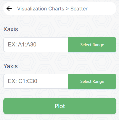
A scatter plot is a type of chart that displays individual data points on a two-dimensional graph. Each point represents the values of two variables, allowing for the observation of patterns, correlations, or outliers.

### Example:

Imagine a scatter plot depicting the relationship between the temperature and ice cream sales at an ice cream stand over a year. Each point on the scatter plot represents a specific day, with the x-axis representing the temperature on that day and the y-axis representing the corresponding ice cream sales. The scatter plot allows for the observation of whether higher temperatures correlate with increased ice cream sales.

<figure><img src="https://2063668468-files.gitbook.io/~/files/v0/b/gitbook-x-prod.appspot.com/o/spaces%2F9RcwqzNNsjo496JLJ2Ob%2Fuploads%2FEf9g9xxtWLwBPvsAXBov%2Fimage.png?alt=media&amp;token=2e953dd9-2b56-4c85-b580-c63a1193ce7f" alt=""><figcaption></figcaption></figure>

### Steps:

* Highlight the range of cells containing your data in Google Sheets. Similar to Excel, for X-axis values, select cells in column A (e.g., A1:A30), and for Y-axis values, select cells in column C (e.g., C1:C30).
* Click on Plot to create a Scatter Chart.
* You can customize your chart using options in the Chart Editor. For example, you can title your chart, adjust the axis labels, and more.

### Output:


# Area Chart

An area chart is a type of chart that displays data points as colored areas between a line and an axis. It is useful for illustrating the cumulative magnitude of a variable over a continuous interval.

### Example:

Visualize an area chart displaying the cumulative website traffic for a blog over the course of a year. The x-axis represents the months, and the y-axis represents the total number of visitors. The area between the line and the x-axis is filled with color, emphasizing the growth in cumulative website traffic. This chart provides a clear representation of the overall trend in visitor numbers over the year.

<figure><img src="https://2063668468-files.gitbook.io/~/files/v0/b/gitbook-x-prod.appspot.com/o/spaces%2F9RcwqzNNsjo496JLJ2Ob%2Fuploads%2FBEPORFKtBNUjfjxzTVbt%2Fimage.png?alt=media&amp;token=669cc4dc-5d53-425c-adae-f5906be5d25b" alt=""><figcaption></figcaption></figure>

### Steps:

* Highlight the range of cells containing your data in Google Sheets. Similar to Excel, for X-axis values, select cells in column A (e.g., A1:A30), and for Y-axis values, select cells in column C (e.g., C1:C30).
* Click on Plot to create a Area Chart.
* You can customize your chart using options in the Chart Editor. For example, you can title your chart, adjust the axis labels, and more.

### Output:


# Media


# Video Tutorials

**PredictEasy Tutorials**

<table data-view="cards" data-full-width="false"><thead><tr><th></th><th data-hidden data-card-cover data-type="files"></th><th data-hidden data-card-target data-type="content-ref"></th></tr></thead><tbody><tr><td><strong>PredictEasy Introduction | No Code AI-Based Data Analytics Platform</strong></td><td><a href="https://2063668468-files.gitbook.io/~/files/v0/b/gitbook-x-prod.appspot.com/o/spaces%2F9RcwqzNNsjo496JLJ2Ob%2Fuploads%2FTgMxZHYGboUADOzYZgXB%2FYoutube%20Cover_PredictEasy%20intro.jpg?alt=media&amp;token=0502dbed-858f-46e7-a047-07fc3e13066d">Youtube Cover_PredictEasy intro.jpg</a></td><td><a href="https://youtu.be/o1VqEkdgHUg?si=jUVXsU0aXIw_II02">https://youtu.be/o1VqEkdgHUg?si=jUVXsU0aXIw_II02</a></td></tr><tr><td><strong>PredictEasy Tutorial | No Code AI-Based Data Analytics Platform</strong></td><td><a href="https://2063668468-files.gitbook.io/~/files/v0/b/gitbook-x-prod.appspot.com/o/spaces%2F9RcwqzNNsjo496JLJ2Ob%2Fuploads%2FTgMxZHYGboUADOzYZgXB%2FYoutube%20Cover_PredictEasy%20intro.jpg?alt=media&amp;token=0502dbed-858f-46e7-a047-07fc3e13066d">Youtube Cover_PredictEasy intro.jpg</a></td><td><a href="https://youtu.be/sTZ56J5Bs-U?si=S_78YQi71f2cKh9O">https://youtu.be/sTZ56J5Bs-U?si=S_78YQi71f2cKh9O</a></td></tr><tr><td><strong>PredictEasy's Google Add-On</strong> </td><td><a href="https://2063668468-files.gitbook.io/~/files/v0/b/gitbook-x-prod.appspot.com/o/spaces%2F9RcwqzNNsjo496JLJ2Ob%2Fuploads%2FTgMxZHYGboUADOzYZgXB%2FYoutube%20Cover_PredictEasy%20intro.jpg?alt=media&amp;token=0502dbed-858f-46e7-a047-07fc3e13066d">Youtube Cover_PredictEasy intro.jpg</a></td><td><a href="https://youtu.be/1y5xu5VcBCo?si=MfSC4SNnUDSRu_--">https://youtu.be/1y5xu5VcBCo?si=MfSC4SNnUDSRu_--</a></td></tr></tbody></table>

**PredictEasy Use cases**

<table data-view="cards" data-full-width="false"><thead><tr><th></th><th data-hidden data-card-cover data-type="files"></th><th data-hidden data-card-target data-type="content-ref"></th></tr></thead><tbody><tr><td><strong>No-Code analysis for Health Insurance</strong></td><td><a href="https://2063668468-files.gitbook.io/~/files/v0/b/gitbook-x-prod.appspot.com/o/spaces%2F9RcwqzNNsjo496JLJ2Ob%2Fuploads%2FzFUzMCBMlY7pp5X2187u%2FYoutube%20Cover_PredictEasy%20_Health%20insurance.jpg?alt=media&amp;token=83ad8e26-14bc-4173-a9f1-0639b6fe9818">Youtube Cover_PredictEasy _Health insurance.jpg</a></td><td><a href="https://youtu.be/sTZ56J5Bs-U">https://youtu.be/sTZ56J5Bs-U</a></td></tr><tr><td><strong>A Data Analytics study in Supply chain</strong> </td><td><a href="https://2063668468-files.gitbook.io/~/files/v0/b/gitbook-x-prod.appspot.com/o/spaces%2F9RcwqzNNsjo496JLJ2Ob%2Fuploads%2F1gJr4URoXMQSueCFx4dE%2FDALL%C2%B7E%202023-11-21%2012.16.21%20-%20T-Test%20%20%20in%20statistics.png?alt=media&amp;token=abee5d7a-9b20-489c-b04b-66ca8632e7de">DALL·E 2023-11-21 12.16.21 - T-Test   in statistics.png</a></td><td><a href="https://youtu.be/kOotPP6dFE8">https://youtu.be/kOotPP6dFE8</a></td></tr><tr><td><strong>Reducing</strong> <strong>Telecom Churn using PredictEasy</strong></td><td><a href="https://2063668468-files.gitbook.io/~/files/v0/b/gitbook-x-prod.appspot.com/o/spaces%2F9RcwqzNNsjo496JLJ2Ob%2Fuploads%2FW6T2PuryE96h0FS60n0j%2FYoutube%20Cover_PredictEasy%20_Emplyee%20attrition.jpg?alt=media&amp;token=0e2f9232-f2d9-44fc-a5a4-e343382fc761">Youtube Cover_PredictEasy _Emplyee attrition.jpg</a></td><td><a href="https://youtu.be/F-LjJ43ccUU">https://youtu.be/F-LjJ43ccUU</a></td></tr><tr><td><strong>Analysing Windmill Machine Failure using PredictEasy</strong></td><td><a href="https://2063668468-files.gitbook.io/~/files/v0/b/gitbook-x-prod.appspot.com/o/spaces%2F9RcwqzNNsjo496JLJ2Ob%2Fuploads%2FAxSDC04a9ahgRY8OeRKP%2FYoutube%20Cover_PredictEasy%20_windmill%20failure.jpg?alt=media&amp;token=e7914b47-093b-4dac-a799-7d76e80b29d8">Youtube Cover_PredictEasy _windmill failure.jpg</a></td><td><a href="https://youtu.be/944MipoiFKE">https://youtu.be/944MipoiFKE</a></td></tr><tr><td><strong>Network Intrusions Analysis using PredictEasy</strong></td><td><a href="https://2063668468-files.gitbook.io/~/files/v0/b/gitbook-x-prod.appspot.com/o/spaces%2F9RcwqzNNsjo496JLJ2Ob%2Fuploads%2FUcK7FcnoC6I9ViiKVOM5%2FYoutube%20Cover_PredictEasy%20_Cyber%20Security.jpg?alt=media&amp;token=ebd48e35-351f-4915-b787-2503031b138f">Youtube Cover_PredictEasy _Cyber Security.jpg</a></td><td><a href="https://youtu.be/vBqKHw0348k?si=XG19NJ6x3ND-K1aT">https://youtu.be/vBqKHw0348k?si=XG19NJ6x3ND-K1aT</a></td></tr><tr><td><strong>Breast Cancer Analysis using PredictEasy</strong></td><td><a href="https://2063668468-files.gitbook.io/~/files/v0/b/gitbook-x-prod.appspot.com/o/spaces%2F9RcwqzNNsjo496JLJ2Ob%2Fuploads%2FgNlQJWubaJnBQSNWuFRm%2FYoutube%20Cover_PredictEasy%20_Breast%20cancer.jpg?alt=media&amp;token=94442686-740e-4695-9d56-acd7be1a176d">Youtube Cover_PredictEasy _Breast cancer.jpg</a></td><td><a href="https://youtu.be/0Jb4xpDeNQQ?si=mzfmaL_EYR9Kv6bX">https://youtu.be/0Jb4xpDeNQQ?si=mzfmaL_EYR9Kv6bX</a></td></tr></tbody></table>


# Articles

User-generated articles showcasing experiences with PredictEasy, highlighting its functionality across diverse sectors and explaining how the platform operates.

### **Article by PredictEasy users and team:**

{% embed url="<https://cleverinsighthq.medium.com/list/predicteasy-ca78e60619b2>" fullWidth="false" %}

### **Employee Attrition Using PredictEasy**

{% embed url="<https://medium.com/@elsasaji02/prescriptive-analysis-of-employee-attrition-a-data-driven-approach-1d1b595ba828>" %}

### **Democratizing Predictive Analytics** <a href="#id-56c4" id="id-56c4"></a>

{% embed url="<https://medium.com/@pwarrier/democratizing-predictive-analytics-with-no-code-solutions-2dea17848ba3>" %}

### Healthcare analytics with PredictEasy to find CKD

{% embed url="<https://medium.com/cleverinsighthq/shaping-the-future-of-healthcare-with-predicteasy-for-ckd-fb6de8d89dd8>" %}

### Supply chain management with PredictEasy

{% embed url="<https://medium.com/@vijay.balaji/last-mile-delivery-innovation-evolving-the-paradigm-of-supply-chain-management-427c5768609f>" %}

### Backorder management with PredictEasy

{% embed url="<https://medium.com/@elsasaji02/mastering-the-supply-chain-optimizing-back-order-shipment-prediction-through-feature-engineering-1f55b7e11627>" %}


# FAQ?


# Contact

<table data-view="cards"><thead><tr><th data-card-target data-type="content-ref"></th><th data-type="content-ref"></th><th data-hidden data-card-cover data-type="files"></th></tr></thead><tbody><tr><td></td><td></td><td></td></tr><tr><td></td><td></td><td></td></tr></tbody></table>